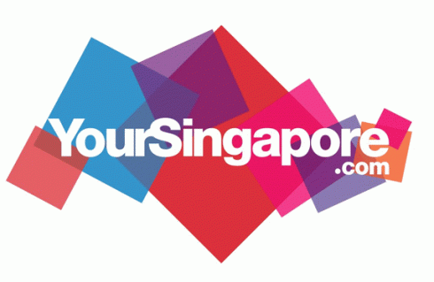
After 7 years, Singapore Tourism Board has quietly dropped the much maligned ‘Uniquely Singapore’ slogan.
In its place is ‘YourSingapore’ – a logo some found bland, non-controversial, with no meaning at all; others however delighted in its visual cliché animated version finding it engaging and literally, more dynamic. Looking past the typography, the morphing clump of imagery makes a contour of Singapore’s shape and as seen in the video above, is sublimely cool.
Mr. Ken Low, assistant chief executive of Singapore Tourism Board’s marketing group said that the new logo and tagline was a result of eight months of research and brain storming between STB and its agencies. “We were very excited about another concept but our research showed that our target audience in some key markets could not understand it. YourSingapore is simple and inviting and can be understood everywhere.”
The strategy behind the evolution of the ‘Your Singapore’ tagline was based on three factors:
1. Highlighting its attributes as a destination.
2. Building an emotional connect that visitors experience in Singapore, and
3. Tapping into the motivational factors that drive their decision making while differentiating the Singapore brand from the others.
BBH Asia Pacific was responsible for the creation of the ‘Your Singapore’ logo for the Singapore Tourism Board.
jbtakenote in May 24, 2010 commented:
“As part of Singapore’s Rebranding (out is the old tag line – “Uniquely Singapore” – and in is “Your Singapore”), the national tourism board has done something truly amazing. It’s a living, breathing logo. An animated creation that does more than create a memorable pattern in the minds of potential tourists: It morphs to connect that brand to a particular type of visitor. It can be animated to show the diversity of the destination, or – through still images – connect the brand to one psychographic of traveler in one specific moment.
I’m pretty sure this is a first (I’m also sure that you will correct me if I’m wrong). At least in the world of destination marketing we have never seen anything like it before. I have the link, but before I send you to it, a bit more explanation is in order. The logo features the slogan “Your Singapore” super-imposed on a background in the shape of the geography of the island itself. It is the artistic content that makes up that background which offers the opportunity for that background graphic to allow the destination to conceptualize what that slogan means: Think design from foods and wines for culinary travel, or flowers and a hummingbird for those looking for natural scenery.
This is truly impressive, and I think in the age of the Internet, downloadable video and flash animation, represents a logo for our times. And a logo with purpose.”
In his blog article ‘Why rebrand?‘, Raimi Hamdi commented:
What do you think?
Visit the YourSingapore website:


July 25th, 2013 at 1:40 pm
I am really grateful to the owner of this web page who has shared this fantastic paragraph at here.