by Lars Hasvoll Bakke, Cre:Source
Germany had been the cradle of many of the wacky avant-garde art movements that appeared around the turn of the century, and most importantly when it comes to posters, it was the birth-place of “Plakatstil”.
The word means “Poster style” and was a modern take on posters which would have a clear, fundamental influence on poster design until the end of World War II, and even beyond that. Posters in this style would feature few but strong colours, a clean (as in non-complex), minimal look and bold, clear types.
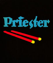
#1
Poster #1 is regarded as the first example of true Plakatstil. Designed by Lucien Bernhard in 1905, it won a poster competition for the Priester match company. No fuzz or clutter, just the matches and their brand name on a black background. The bright and clear colours would surely make it stand out among other posters competing for attention, advertising posters of the day were often no more than text on a large sheet of paper.
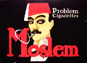
#2
Continuing in the same style is poster #2, an advert for the Moslem brand of cigarettes from the Berlin-based Mahala-Problem cigarette factory. If anyone can offer an explanation to the “Problem” bit of the factory name, I’d be very grateful. I’m assuming there’s a good reason for appending such a negative word to their name.
World War I
The Germany that entered World War I was a culturally conservative and rather authoritarian society were the state played an essential role in industry. Perhaps in part due to said conservative attitude, modern poster styles, as embodied in Plakatstil, did not make a clear breakthrough during the war, only partially.
German wartime posters are a mix of older, “natural” looking styles and more modern forms, not at all unlike what can be seen amongst other belligerents of the war.
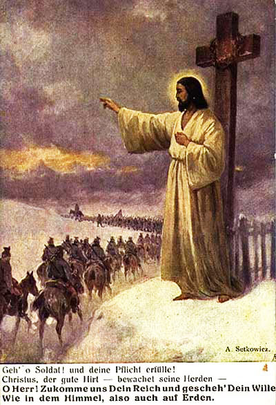
#3
#3 Go on soldier! And fulfill your duty! Christ, the good shepherd watches over his flock. Our Father in heaven, hallowed be your name, Your kingdom come, your will be done, on earth as in heaven.
The claim of divine support in war may be as old as war itself. The crusaders thought they had it, all sides in the 30-years war of the 17th century were sure they had it. During World War II, an American poster from World War II presented the boxer Joe Louis stating that the allies would win because God was on their side, while German soldiers fought with belt buckles stating “Gott Mit Uns” (“God is with us”)
Depicting it as it’s done here however, is rather gutsy in my eyes, with Jesus himself personally blessing and watching over the soldiers as they ride on to the front. This poster is clearly done in the style of a painting, a style that was still regularly to be seen at this time but would soon be displaced by more modern styles.
On ground level, you see a soldier, presumably German, cheering up at the sight of the two other figures. Mounted on horse is the Emperor (or “Kaiser”) Wilhelm II, who reigned as the “strong man” in Germany from 1888 until his abdication in 1918.
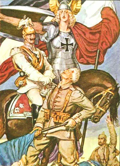
#4
#4 As in all images of him, the Kaiser concealed his left hand, which was damaged due a birth defect. Protecting the emperor with her shield is a very masculine, slightly scary depiction of Germania, the female national personification of Germany.
Such personifications were apparently all the rage at the time, Britain had their Britannia, France had Marianne and the United States had both Lady Liberty and Colombia.
While all the heroic symbolism and nationalism in this poster is interesting, I can’t help feeling this poster is something of a failure in the looks department; rather than a beautiful, German woman, poor Germania looks positively transgendered!
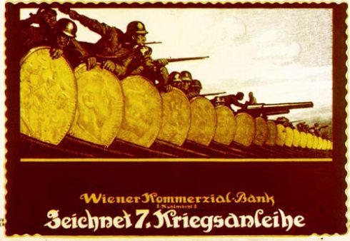
#5
#5 Subscribe to the 7th war bonds – 1917
One long row of golden Marks (German currency) shielding German soldiers, to symbolize the value of your contribution if you help fund the war effort.
My reason for including this poster is not the excellence of its design, symbolism or message, but rather as an example of the prevailing style in poster design during the war.
It’s not merely a heap of text piled onto a piece of paper. Nor is it the realistic looking paintings as seen in poster #3 or the simplicity of the Plakatstil, but rather something in between.
The way people and items are portrayed is still fairly realistic, but the designers have changed their use of colours, going for a few, clear and expressive colours that are easier to print and give a strong visual impact.
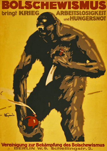
#6
#6 Bolshevism brings war, unemployment and famine. Association for conquering Bolshevism – 1918
Communism, both as an idea and as a potential military force based out of Russia, was a threat to just about every established power in the world, and the reaction from the great powers of the west was swift.
But as communist Russia (or in other words, the Bolsheviks) had withdrawn from the war in the previous year, soon after the revolution, it’s clear that this poster has little to do with the war as such, but rather fear of a new enemy that had risen in the east.
I must say I enjoy these kinds of depictions, all about making the enemy look as savage and brutal as possible, and this particular poster does an excellent job at that!
As an educational side note, it’s worth mentioning that Bolshevism and Communism are not one and the same thing. During the Russian there were two “parties”, the Mensheviks and Bolsheviks. The latter can be regarded as the hardliners amongst the two sides. It was them who managed to take control of the revolution and put themselves at the reins of the new state.
7 Heroes from the front! Home greets you! You are heartily welcome! – 1919
1919 was the year of the Versailles treaty which dealt with the treatment of Germany after the war, and this posters appears to have been produced after the war had ended. Germany had to accept blame for the war occurring in the first place, huge war indemnities were to be paid and the size of the army was limited to 100 000 men.
It was the civil government that was forced to sign the treaty, which was highly unpopular in Germany, something which hurt the legitimacy of the whole democratic system in Germany in the years to come.
The army on the other hand, as is suggested by this poster, got through the treaty unscathed when it came to their standing in society. The war veterans and the two leading generals, Hindenburg and Ludendorff, were seen as the great heroes.
While at first glance, this might seem like another take on the concept of a holy figure greeting the soldiers (as in poster #3), this particular figure bears a remarkable similarity to the “Münchner Kindl”, a friar boy appearing in the city seal of the city of Munich, with roots as far back as the 13th century.
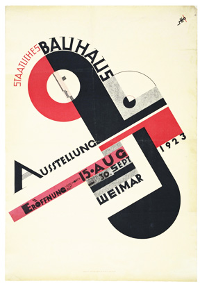
#8
#8 National Bauhaus Exhibition – 1923
Bauhaus was a highly influential school of art and design originally founded in the new capital of Germany after World War I, Weimar.
As this advertising poster clearly shows, it was part of the modernist movement of the day, and its supporters worked hard to spread a greater understanding and acceptance of Bauhaus and the modernist movement as a whole throughout the German people.
In the same year of the exhibition advertised here, Adolf Hitler made his first attempt at attaining power in Germany in the Munich Beer Hall Putsch. Although it failed, it was the first sign of what was to come, and as will be shown later, it would mean the end for the early modernist movement in Germany.
The 1932 Elections
German politics after World War I was a real mess, especially in the early 30s. The NSDAP (the Nazi party) used their paramilitary organization, the SA, to add to the chaos. The SA were basically a thug organization that would attack the meetings of rivaling parties, and fight it out in the streets with communist gangs and other perceived enemies.
Effectively making themselves out as the solution of all Germany’s woes of the time, the Nazi party grew dramatically in the early 30s, though they never won a majority in a free election.
In 1932, matters came to a head in a number of elections and political maneuvers that ended with the swearing in of Adolf Hitler as chancellor in January 1933. Hindenburg, the old war hero that was president of Germany at the time thought Hitler to be a puppet he could control himself. He was sorely mistaken. Below are a number of interesting political posters from 1932.
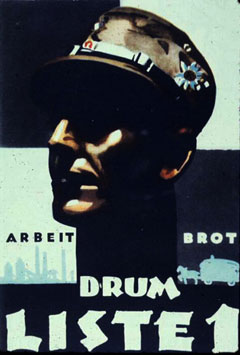
#9
#9 Work – Bread – Therefore, list 1
Poster #9 shows the head of an SA soldier surrounded by the words work and bread, alluring promises in a Germany by then in the depths of the global depression which started in the US in 1929.
It’s a highly expressive poster, where the shadows in the soldiers face give him a terribly menacing look, though to me, it looks a bit over the top, keeping in mind this was designed as an enticing election poster, not a depiction of the enemy.
The Nazi take on the arts was a reactionary one, they promoted what they perceived to be specifically German in music, literature, painting, architecture and so on. A great number of artists that they regarded as un-German or even degenerate were forbidden from working and teaching, their works confiscated by the state. The modernist movement in Germany was effectively strangled by the Nazis, including the Bauhaus school which was closed in 1933.
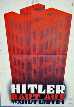
#10
#10 Hitler Builds – Choose list 1
But when it came to propaganda posters, the Nazis seemed perfectly willing to break their own rules. As illustrated especially well by poster #10, and many of the posters to come in this article, the Nazis willingly incorporated modernist ideas in their propaganda.
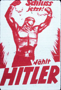
#11
#11 Enough! – Elect Hitler
The explosive poster #11 is the work of one of propaganda minister Goebbels’ favorites when it came to propaganda, Hans Schweitzer, better known as Mjölnir. He favored painting and drawing over the techniques seen in the previous two posters, and in this particular one, he is able to achieve an astonishingly energetic poster.
Hitler was born and raised in Austria, and as such, was not actually a native of the country in which he tried to be elected to rule. But as poster #12 claims, a soldier who fought at the front for a country would thus earn his citizenship, something Hitler did indeed do during World War I, fighting in the Bavarian portion of the German army. Not until this year, 1932, did Hitler get his official German citizenship.
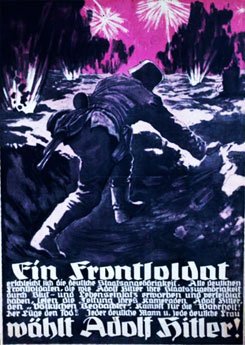
#12
#12 A front soldier will vote for Adolf Hitler!
12: A front soldier earns his German citizenship. All German front soldiers who, like Adolf Hitler, earned and proved their citizenship through blood and the risk of their lives. Read the ‘Völkischer Beobachter’, the newspaper of their comrade Adolf Hitler. Fight for the truth! Death to the lie! Each German man and woman will vote for Adolf Hitler!
In this overloaded poster, you see the first occurrence (in this blog post) of a variation of the Gothic typefaces which seems to have been wildly popular during the Nazi era, and which you will see much of in the coming posters.
Its widespread use seems strange to modern eyes, it’s ridiculously hard to read and I can only imagine the reactions of contemporary readability experts if someone were to use types like this today in all seriousness on a poster, on a website or the likes.
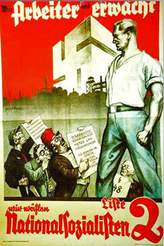
#13
#13 The workers have awakened – Choose the National Socialists [The Nazis]
I picked these two posters as examples of the ingenious way Nazi propaganda would mix and match their enemies so that they would eventually all seem like one big entity. Poster #13 shows a strong, alert German worker who won’t let himself be fooled by the Marxist (the guy with the red hat) or the Jew whispering into his ear.
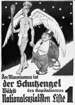
#14
#14 Marxism is the patron saint of of Capitalism – Choose the National Socialists – List 1
The next poster rather hilariously claim that Marxism and capitalism go hand in hand. Here, Marxism is represented by a tall, skinny angel wearing an SPD hat (the Social Democratic party), while capitalism is illustrated by the fat, Jewish banker, a popular stereotype in Nazi propaganda.
Together, these two posters yield some surprising conclusions, firstly that the Jews are the ones behind both Marxism and Capitalism, and that these two ideologies are in fact friends and allies. The cold war suggests otherwise…
On a side note, as was pointed out with regards to one of the posters in my previous post about Soviet propaganda, the Jewish banker is also to be found there, recognized by his “Jewish nose” and top hat. It is indeed a character to be found in many Soviet posters, where he is usually a symbol of the menace of the United States and their capitalism.
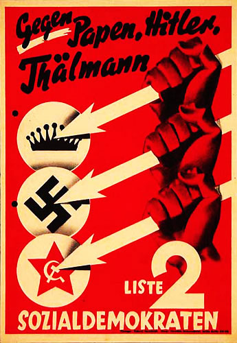
#15
#15 Against Papen [conservative], Hitler [nazi], Thälmann [communist] List 2 – The Social Democrats
I highly doubt the SPD of today would consider using imagery such as this in their campaigning. Back then, social democrats tended to be the a lot more radical, with the SPD in particular being explicitly Marxist.
The imagery of this aggressive poster clearly supports that, with clenched red fists holding spears on a backdrop of even more red. The names listed are the heads of rival parties in the election, conveniently symbolized by a crown, a swastika and a red star. Its a kind of poster you would rather associate with the Soviet union than the rather benign social democrats and labor parties of today.
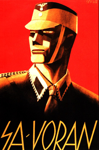
#16
#16 SA – In front (circa 1933)
Poster #16 is another depiction of a terrifying SA soldier, though unlike poster #9, this one doesn’t give off a feeling of being assaulted in a dark alley. While the fascist elements are obvious, it’s still an excellent poster in my eyes, the highly angular style and the slightly glowing eyes all make for an impressive, if foreboding poster.
The level of discipline and training suggested in this poster is something that at least in Hitler’s eyes turned out to be lacking in the average SA member. It was still the thuggish organization it had always been, which was becoming bad PR for Hitler, and he was fearing that the SA with its growing number was turning into a rival for power in Germany. Thus, in a few days in June and July of 1934, he had the leaders of the SA murdered, as well as many other rivals. After 1934, the SA dwindled into oblivion.
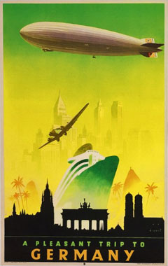
#17
#17 (circa 1935)
Offering a nice break from the ever more sinister propaganda of the 30s are these two travel posters, focusing on the wonders of German technology. Poster #17 shows a number of sights on the journey from some US city, via Rio de Janeiro for some reason then onwards to Berlin and finally, Munich. A pleasant looking advert, though a little cluttered for my taste.
#18
#18 (circa 1935)
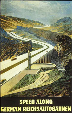
I’m not sure if the landscape in poster #18 is supposed to be scenic, to me it looks utterly barren. The landscape doesn’t seem to be the main focus here anyway, but rather the wonders of the German Autobahn (freeway) system.
The first section of the Autobahn was finished in 1935, and due to it being one of Hitler’s favorite projects, it continued rapidly from there on until well into the war years. They were the first of their kind in the world, and while nowadays, advertising something as common as a freeway might seem a bit strange, it was cutting edge and exciting at the time.
#19
#19 (circa 1935)
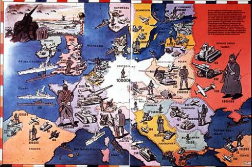
Looking rather like a wartime board game, this poster was designed to drive home to the German people the country’s intolerable military situation as dictated by the Versailles treaty of 1919.
The treaty had limited the German army to 100 000 men and severely restricted the production and utilization of advanced military equipment such as airplanes, warships and tanks. The poster convincingly illustrates how Germany is surrounded by countries with very few such limitations, and make them all out as enemies of Germany (notice how all the soldiers and weapons are turned towards Germany).
It was in 1935, around the printing of this poster, that Germany openly started to violate the treaty by rebuilding its navy, establishing the Luftwaffe (Air Force), creating tank divisions and magnifying the number of soldiers in the armed forces.
#20
#20 Support the welfare organization “Mother and Child” (circa 1935)
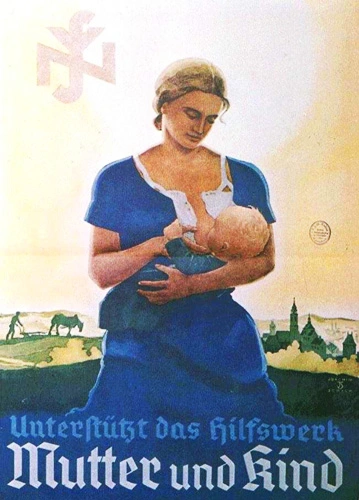
As in the other warring states of World War I, women had been brought into German factories to perform the work of the men who had gone off to the front. And while women for the most part went back to their old roles after the war, in Germany, the Nazi regime explicitly promoted women’s primary role in society as housewives and the rearers of the next generation of Germans.
This idyllic poster shows this in a rural setting, contrasting the women’s role with that of herhusband, seen in the background, tending the fields while the woman breastfeeds her child.
#21
#21 How much longer without colonies? (circa 1936 or later)
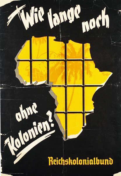
Until the Treaty of Versailles, Germany had been one of the minor colonial powers in Africa. From 1936, the supporters of the reclamation of these colonies were organized into the “Reichskolonialbund” (The National National Colonial Association) which created this poster, showing how Germany is shut out with iron bars from the promises of Africa.
This movement never gained significant support in Germany, so the former colonies were never a prioritized goal in the coming war. Hitler himself cared little for this, looking instead to the east, to Eastern Europe as the truly valuable areas for colonization.
German migration and “colonization” of Eastern Europe had been ongoing since the middle ages and large populations of Germans were to be found scattered throughout. In the Nazi era, this drive, or longing for the east (“Drang nach Osten”) was seen as a primeval force, a natural right of the German people.
Thanks to the racial policies and “science” of the Nazi regime, the Slavic populations of Eastern Europe came to be seen as lesser people than the Germans, and thus were well suited to be ruled as slaves by a German upper-class.
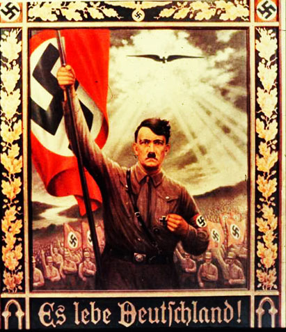
#22
#22 Germany lives! (circa 1930s)
In all its pompous splendor, this is without a doubt one of the most fabulous posters of the Nazi era.
Combining the classic symbolism of the sun breaking through a stormy sky with the sight of a vigorous German people led by a firm and resolute Hitler, the poster is as subtle as a Tiger tank. The kitschy oak-leaf framing is unnecessary though – this poster has no need for a petty frame to grab the viewers attention!
A notable element in this poster is the eagle descending from the sky, analogous to the dove which descended through upon Jesus as he was baptized, through “the heavens parting”.
The Nazi party made itself and its leader into a sort of national religion which partially displaced the various forms of Christianity observed in Germany, and in part due to this, the Nazi relationship to the church(es) was not always an easy one.
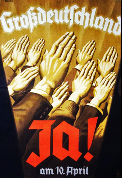
#23
#23 Greater Germany [Vote] Yes! On the 10th of April (circa 1938)
In early 1938, German troops marched unopposed into Austria and performed the “Anschluss” of the country (roughly translates as annexation).
This poster was created in preparation of the plebiscite held on April 10th that year where Austrians were asked to decide whether they wished to be a part of a Greater Germany or remain independent. The official results had 99.73% of the voters supporting the former option.
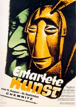
#24
#24 Degenerate art(circa 1938)
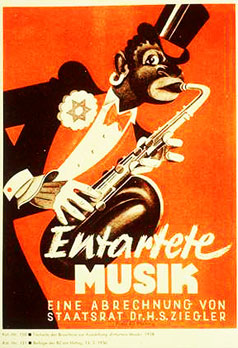
#25
#25 Degenerate music (circa 1938)
As has been mentioned, Nazi cultural policy was strongly opposed to modernist art forms. Inspired by the degeneracy theory of Max Nordau (rather ironically a Jew and co-founder of the World Zionist Organization), they developed their own notion of degenerate (“Entartete”) art, or in other words, modernist art and works by Jewish artists. And as always, the Jew was behind it all, working in the shadows to foul up the purity of German culture.
Poster #24 shows that clearly enough, presenting a piece of modern sculpture with the likeness of a stereotypical, big-nosed Jew lurking in the background.
Likewise, in poster #25, the star of David on the lapel of the African-American jazz-musician hints at what is put forth explicitly in other posters of the time; that Jews are the original inventors of degenerate Jazz music, while the African-Americans playing it are merely their tools.
These two posters were created in connection with a series of highly popular exhibitions that toured Germany, displaying various forms of degenerate art, usualy in a mocking manner.
The works featured had been confiscated from their creators or owners in the years since 1933 and included well known artists like Marc Chagall, El Lissitzky, and Max Ernst. It’s worth noting that since Jazz was so popular in Germany at the time, it was not effectively banned until the start of World War II.
#26
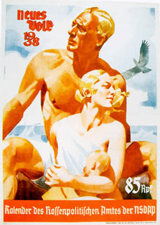
#26 New People 1938 – Calendar for the office for race policy of the NSDAP
One can’t help being taken in by the style in poster #26. On the backdrop of wispy clouds and, the splashing of the sea and a wailing sea bird, you see an impossibly blonde, healthy and beautiful family relaxing in a rather theatrical manner. It illustrates the accepted family hierarchy with the big strong man of the house towering above and protecting his wife, who on her part takes care of their child.
Looking beyond the style of the poster, the theme and ideology behind is less idyllic. “Neues Volk” was a fairly widely circulated magazine promoting the Nazi version of “racial hygiene”, the pseudo-scientific notion that the German and related “nordic” races are destined to be rulers of the other inferior races of the world, due to the formers genetic superiority. Poster #26 shows a picture perfect aryan family, the new german people the Nazi party wanted.
The magazine concerned itself amongst other themes with the importance of Germans maintaining a high birthrate, the mentally disabled and advice against racial mixing, since the master race had to be kept genetically pure to retain its supremacy.
#27
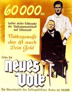
#27 60,000 Reichsmarks is how much this mentally handicapped person will cost society throughout his life. Citizens, this is your money too. Read “New People” – The monthly magazine of the office for race policy of the NSDAP (circa 1938)
Unlike the first poster, in the second one there isn’t even the slightest attempt at concealing the theme behind a pretty facade. It’s one of the thematically most straight forward Nazi posters I’ve seen, and it’s just as ugly as the idea behind it. It was an attempt at justifying to the German public the killing of handicapted people, due to matters of economy and racial hygiene.
In what was known as the T4 program, between 200 000 and 250 000 disabled children, and later also adults, were killed in Germany and the occupied areas. Due to widespread public opposition in Germany, the program officially ended in 1941, but the killings continued in less systematic forms in Germany, and on a much larger scale in the east.
#28
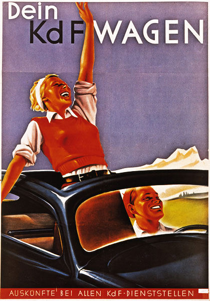
#28 Your KdF Car (circa 1939)
Designed in the 1930s by Ferdinand Porsche (albeit heavily inspired by the Tatra T97 car), the Volkswagen, also known as the Beetle, was supposed to become the people’s car (which is the meaning of the name) in Nazi Germany. Production had only just started when the war erupted in Europe in 1939, and so the relatively few cars that were built were delivered to the military.
After the war, this simple, cheap and good looking little car became a massive success, with more than 20 million units built in a production run that didn’t end until the year 2003.
In this poster, a young couple is seen blissfully cruising through an alpine landscape in what is here referred to as a KdF-car. They are presumably riding at high speed on one of the Autobahns being constructed at the time (see poster #18).
World War II
The European stage of World War II erupted in September of 1939 with the German invasion of Poland. In the year before, Germany had annexed Austria and the Sudetenland portion of Czechoslovakia.
The latter had been approved by France and the United Kingdom as part of the policy of appeasement where it was thought that German expansionist designs could be limited by more or less letting Germany have what it wanted.
UK prime minister Neville Chamberlain famously made a fool of himself when returning from the Munich conference where the annexation had been approved, he waved the deal signed with Hitler in the air and said:
“My good friends, for the second time in our history, a British Prime Minister has returned from Germany bringing peace with honour. I believe it is peace for our time.”
#29
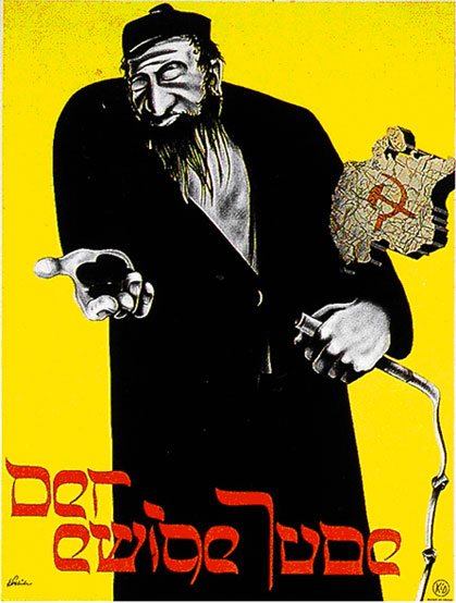
#29 The eternal Jew -(circa 1940)
An advertising poster for the best known German propaganda film aimed at the Jews. In a type with a clear similarity to the Hebrew alphabet, the title “Der ewige Jude” (The eternal Jew) is spelled out, alluding to the eternal nature of the corruption of the Jews.
In the style of a documentary, the film contrast the laborious and moral German/Nordic race with the hedonistic, greedy and lazy Jews. In the poster, this is symbolized by the content of the mans hands, money and what looks like a whip. Seemingly slapped on top at the last minute is a map piece with the communist hammer and sickle, to make sure that the Bolshevik connection isn’t forgotten.
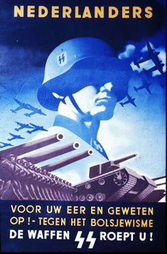
#30
#30 Dutchmen – For your honour and conscience! Against the Bolshevism – the Waffen-SS calls you!
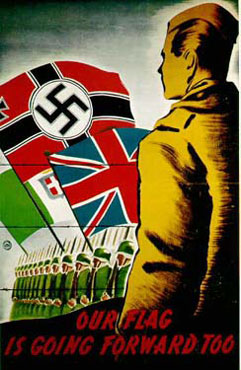
#31
#31
Poster #31 is without doubt one of the least successful propaganda posters presented here. Printed in 1944, its purpose was to recruit POW’s from Britain and its Commonwealth into German service.
It shows a British POW behind barbed wire, witnessing the flag of Britain marching victoriously ahead together with the German and Italian flags of the time. Only a few hundred Britons were recruited for the “British Free Corps” and only one of them saw any fighting in the end.
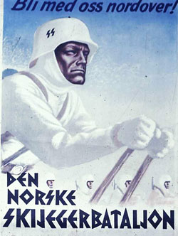
#32
#32 Come north with us!
The Norwegian Ski Ranger Battalion
(Above and below) Two Waffen-SS recruitment posters from my home country, Norway. Here, as in the rest of Europe, it was the threat of communism that really scared people.
Not only did Norway have a common border with the Soviet Union, it also bordered Finland, which had been through a devastating communist-royalist civil war concurrently with the Russian revolution, and a series of brutal wars between Finland and the Soviet Union from 1939 onwards to 1944. Therefore, the fear of a communist revolution and/or a Soviet invasion was felt more vividly in Norway than elsewhere, something the Waffen-SS played on.
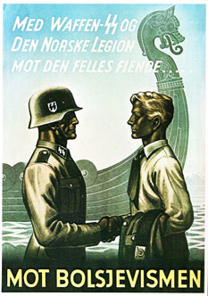
#33
#33 With the Waffen-SS and the Norwegian Legion against the common enemy… Against Bolshevism (circa 1940 onwards)
There’s an incredibly stern quality to these posters. In poster #32, it’s got a lot to do with the decidedly merciless facial expression of the soldier upfront, but perhaps even more due to his skin colour. He is not merely a man of flesh and bone, this guy is rock-solid, made of steel!
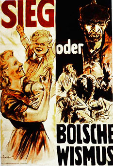
#34
#34 Victory Or Bolschevism (circa 1943)
The pivotal battle of Stalingrad ended in early 1943, and afterwards, German propaganda became less and less about imminent victory in the east, but rather about the Soviet threat to the very survival of Germany.
Poster #34 is just that, created not long after Stalingrad. To the left, a joyful, racially pure German mother and child, while on the right, the alternative, dreadful oppression under the Bolsheviks. In addition to being ideologically astray, the decidedly ugly face of the Bolshevik serves to convince the viewer that they are also genetically inferior, as was stated by the official racial policy of the Nazi party.
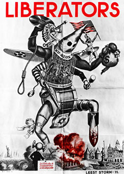
#35
#35 (circa 1944)
The next poster was printed in several languages, this particular one was made for posting in the Netherlands in 1944, where allied forces appeared in the second half of that year.
It shows how a huge American monster, composed of a lot of prominent American symbols, is trampling about in Europe, laying wreck to its old culture, presumably to replace it with inferior American culture.
I find this poster rather funny, I’m quite simply impressed to see just how many American symbols the creator managed to cram into the poster, the KKK, a tommy gun, Jitterbug and so on. The Norwegian language version of this poster had the words “Kultur-terror” printed at the top instead, meaning “Cultural terrorism”.
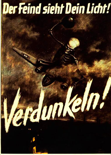
#36
#36 The enemy sees your light! BLACKOUT! (circa 1944-45)
Riding on what appears to be a burning B-26 bomber is death himself, throwing bombs at the poor sod who has been dumb enough to forget about his blackout curtains.
The Royal Air Force had been bombing Berlin since 1940, but not until 1943 did widespread bombing of Germany take place. When that happened however, it was ferocious, with the 1945 bombing of Dresden being particularly infamous.
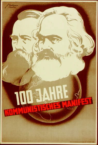
#37
#37 100 years – The communist manifesto (circa 1948)
The war is over, we’re in the DDR (GDR in English, aka. East Germany) and it’s been 100 years since the famously bearded Germans Karl Marx and Friedrich Engels published the “Communist manifesto”. This was of course a cause for celebration in the ostensibly Marxist DDR.
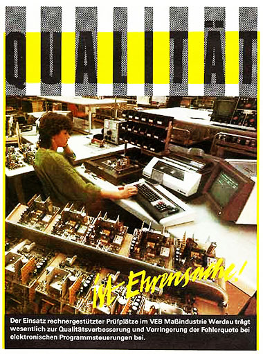
#38
#38 Quality (circa 1988)
Jumping 40 years ahead, the final poster is another DDR issue. It’s the 80s and graphic design of the time dictates ghastly colour combinations and hard, edgy shapes. This particular poster is praising the raise in product quality of a factory which has started using computer technology in its production.
Recommended websites for more on German propaganda, posters and other kinds:
www.calvin.edu – An amazing website with a huge collection of all sorts of propaganda.
www.bild.bundesarchiv.de – Bundesarchiv Picture database – The online imagery database of the German National Archives, which holds huge amounts of photos, posters and other graphical documents of German history.
history1900s.about.com/cs/nazipropaganda – Has a nice collection of interesting german propaganda links.
 future
July 1st, 2014 at 1:58 am
Fantastic website. A lot of useful information here. I’m sending it to a few pals ans also sharing in delicious. And naturally, thank you in your sweat! eadbkkgedced